Visualising ResNets using t-SNE
Last updated: May 26, 2023
Deep neural networks are amazing image classifiers (among many other things!), but don’t you sometimes wonder how exactly they see the data they’re classifying? In a previous post, we saw how to use transfer learning to fine-tune a pre-trained ResNet-18 model to classify various flowers. This will be following up on that with exploring how the trained model “sees” the data it’s classifying.
ResNet recap
Before continuing, let’s recap the architecture of the network we’ll be working with. ResNets (residual networks) are based on the convolutional neural network (CNN) architecture. An example of a basic CNN is provided here:
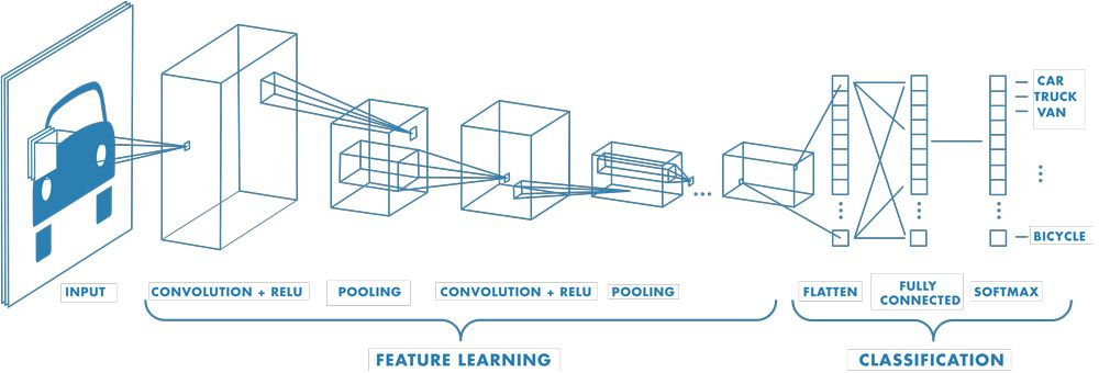
The above diagram, from the MATLAB documentation1, presents the three main types of CNN layers. In summary:
-
Convolutional layers convolve input data with a kernel to produce a feature map. The kernel is usually a 3x3 matrix of weights. A ReLU activation function is applied to feature map to introduce non-linearity – a necessity for solving non-linear problems.
-
Pooling layers aggregate the output of the previous layer to reduce the dimensionality of the data. This reduces the complexity of subsequent layers and therefore decreases the model training time. The utility of pooling layers has recently been questioned, but most convolutional models still have one or more of these.
-
Fully connected layers typically exist only as the final layers of a CNN. Their purpose is to use the features extracted by the convolutional layers to decide on a classification for the input image. The softmax activation is more suitable for this than the ReLU, as the output of the softmax is bound between 0 and 1.
Now, here’s the architecture of ResNet-18 for comparison, from this journal submission 2:
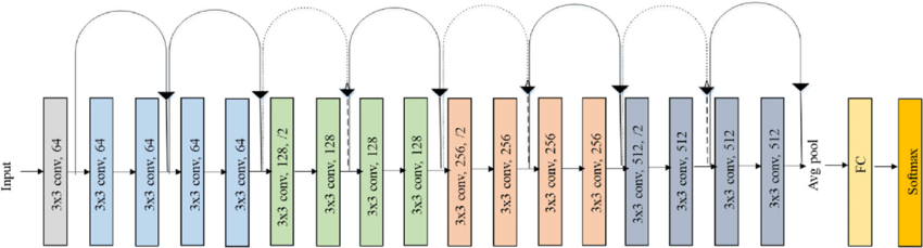
Compared to a simple CNN, ResNets introduce “shortcut connections” between layers, and also drop most pooling operations. This has been empirically shown to improve the model performance3.
What we’re interested in is knowing how the data is represented in the final layers of the model. Unfortunately, the dimensionality of the model’s representation of the data is much to high for us to visualise right away.
Dimensionality reduction using t-SNE
We can use t-SNE (t-distributed Stochastic Neighbour Embedding) to reduce the dimensionality of the data down to something we can visualise. t-SNE aims to preserve relative distances between points in the higher-dimensional space when projecting into a lower dimension4. Distances are measured using Kullback-Leibler divergence4.
In Python, the scikit-learn library has easy-to-use implementation of t-SNE. We’ll be following on from the code and model state the we finished with in the previous post. To get to the bits of the model we’re interested in, we’ll cut the model using the fastai API then run a batch of data through it and collect the output:
# Cut the model right before the classification layer
new_head = cut_model(learn.model[-1], 2)
learn.model[-1] = new_head

# Run data through the new network to derive the feature vectors
x, y = dls.one_batch()
feature_vectors = learn.model(x)
The above method of cutting the model comes from user AmorfEvo in this fastai forum thread 5. It cuts the model right before the classifiction layer so that when we run a batch a data through it, we can extract the model’s final representation of the data. If we print feature_vectors.shape:
torch.Size([64, 1024])
So, we have 64 data samples (our batch size was 64) each of 1024 dimensions. Obviously, we can’t visualise data in 1024D, so here’s where we apply t-SNE to get around our feeble mental limitations:
from sklearn.manifold import TSNE

tsne = TSNE(n_components=2).fit_transform(feature_vectors.cpu().detach().numpy())
Finally, we can plot the output returned by t-SNE:
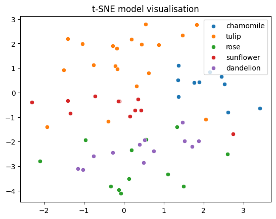
Not bad! Although variance is inevitably lost when we reducing from 1024 dimensions all the way down to 2, the various flower classes nevertheless appear reasonably well separated. The relative distances between the classes also contains semantic meaning. For example, tulips and chamomiles are fairly well removed from the remaining classes. This probably reflects their distinctive shape compared to the other flowers. Meanwhile, roses and dandelions appear almost on top of each other. This is interesting, because we don’t see them as being very similar at all. This is probably a case of variance being lost in projecting the data to a lower dimension. Given the classification accuracy, it’s likely that these two classes are well separated in the model’s feature space.
In summary
We’ve now caught a glimpse into how deep neural networks “see” the data they classify. While this surely isn’t ground-breaking, and probably won’t trigger any Turing-award-winning epiphanies, we did get a pretty neat graph as a reward for our efforts.
References
[1] MathWorks. “What is a convolutional neural network?” (2017), [Online]. Available: https://au.mathworks.com/discovery/convolutional-neural-network-matlab.html.
[2] F. Ramzan, M. U. G. Khan, and S. Iqbal, “A deep learning approach for automated diagnosis and multi-class classification of Alzheimer’s disease stages using resting-state fMRI and residual neural networks,” Journal of Medical Systems, 2019. doi: 10.1007/s10916-019-1475-2.
[3] K. He, X. Zhang, S. Ren, and J. Sun, “Deep residual learning for image recognition,” in Proceedings of the IEEE conference on computer vision and pattern recognition, 2016, pp. 770–778.
[4] G. Serebryakov. “t-SNE for feature visualization.” (2020), [Online]. Available: https://learnopencv.com/t-sne-for-feature-visualization/.
[5] AmorfEvo. “Feature extraction after fine-tune from flatten-layer.” (2022), [Online]. Available: https://forums.fast.ai/t/feature-extraction-after-fine-tune-from-flatten-layer/102791/2